
The 10 Worst Jerseys in NBA History
6 min read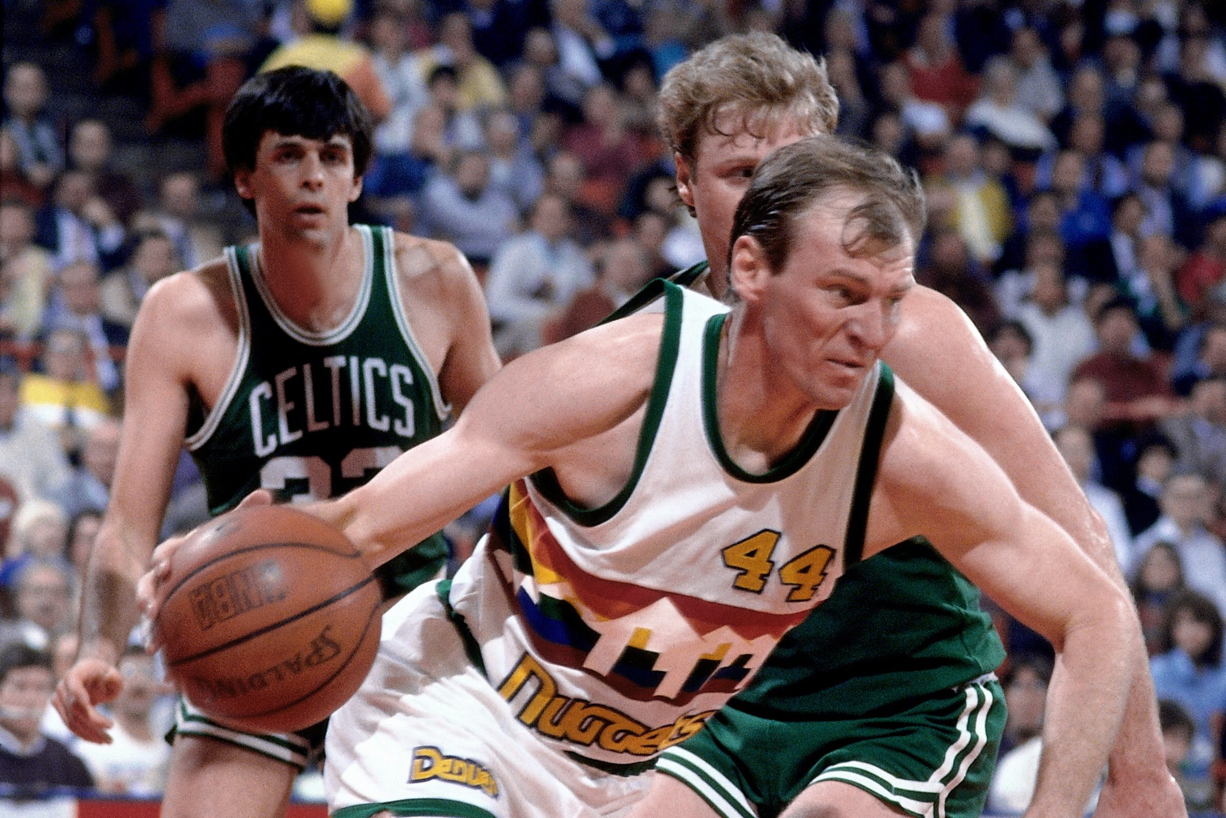
The 10 Worst Jerseys in NBA History
If you feel good, you play good. Play good? That was poor English, but you get the point!
If you have already read our article ranking the worst NHL jerseys then you know where this is going. If not, here it is for your reading pleasure – and visual displeasure. https://usanews.com/sports/The_10_Worst_Jerseys_in_NHL_History
The NBA comes out with new alternate jerseys annually now. They have been unveiling special Christmas Day jerseys for years. The league is always looking at new revenue streams. Producing new jerseys each year is one of the more obvious ways for the NBA to make a new buck.Not all NBA jerseys have been winners over the years.
Some are questionable. Others are just plain awful. I’m confident that the performance of the players wearing these jerseys was affected by the embarrassment of modeling these threads. Would you be able to play well in these uniforms?
I finally understand why professional athletes get paid so much money. Why else would they agree to dress like this? Without further adieu, here are the 10 worst uniforms in NBA history – according to me.
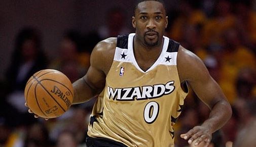
#10 – Washington Wizards Alternate Gold and Black (2006-2009)
Look at Gilbert Arenas in this picture. He may be trying to hold in his laughter at the ridiculousness of this uniform. The black shorts with white and gold trim aren’t bad. It’s the jersey that’s a complete disaster. Why are there so many stars, especially around the collar? It looks like something people wore to disco clubs in the ‘70s.
Washington could have elected to go with a black uniform with gold and with lettering. You want stars on the jersey? Fine. Keep them on the sides only , but the Wizards wanted to stick out. They succeeded. Not in a good way.
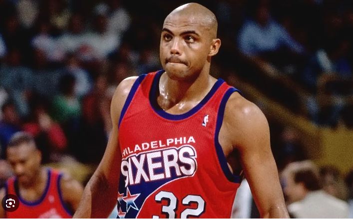
#9 – Philadelphia 76ers (1991-1994)
I understand why Charles Barkley requested a trade from the Sixers in 1992. He didn’t want to be caught dead wearing this uniform anymore. This uniform looks more like something you would see in the CBA during the ‘90s, not the NBA!
The “Philadelphia” in small font above “Sixers” is a pit tacky. Not as tacky as the random flow of stars coming off the word “Sixers.” How could Philly do the late-Moses Malone like this? Champion paid the 76ers to design it. They obviously didn’t pay them enough.
#8 – (Tie) Dallas Mavericks 2003 Road Silver/2004 “Diddy Uniforms”
Mavericks owner Mark Cuban called these road jerseys garbage bags. I think they look like those sauna bags you wear to sweat more. When the team’s OWNER is ripping the jerseys, you know it’s bad. These lasted a total of one game and were scrapped. Thank goodness! Allegedly, P. Diddy designed the other unis. I don’t know if he tried too hard or didn’t try enough. How drunk did Mark Cuban get before agreeing to adopt jerseys with this font? Luckily, Cuban and the Mavericks cleaned them up quickly and adopted the font from the Mavs other jerseys.
#7 – Denver Nuggets (1982-93)
I understand the blue road uniform with the gold trim. The font that reads “Nuggets” isn’t great but isn’t terrible. The number placement on the uniform is a headscratcher. The rainbow with a skyline across the chest just doesn’t do it for me. Besides, very NBA city has a skyline of tall buildings.
The home one is worse. It wouldn’t be so bad if it weren’t for the rainbow wrapping to the back. The early ‘80s edition had green trim on the uniforms. Barf. I get that it was the ‘80s, but c’mon!
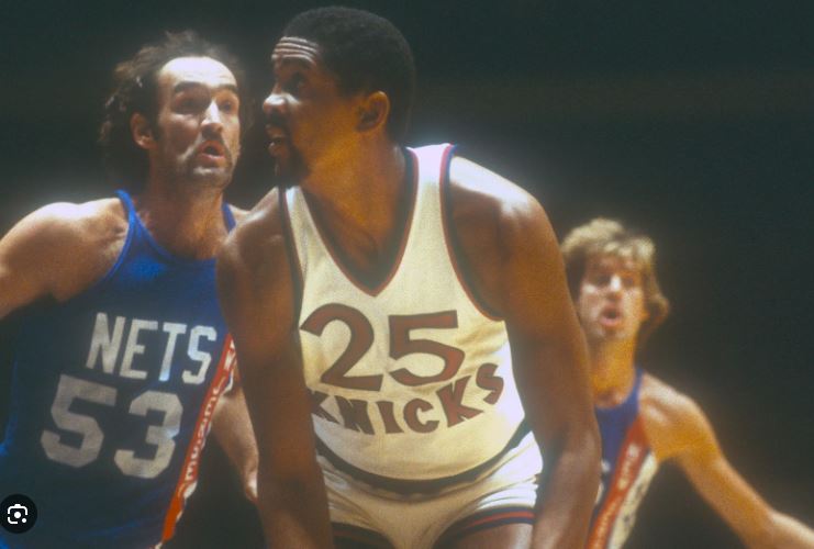
#6 – New York Knicks (1980-83)
As Rick James stated in an episode of “Chappelle’s Show,” Cocaine’s a helluva drug. Since I don’t condone drug use, I’ll chalk up the early 80s edition of the New York Knickerbockers jersey as a temporary moment of insanity for the franchise. The Knicks had a neat, crip blue, white, and orange uniform with crisp font. Why change it?
Apparently, many teams were trying to think outside the box with their jersey designs. They thought too hard. The large number placed above “Knicks” with New York-style font doesn’t look right. Thankfully, they reverted to their previous jersey style in 1983.
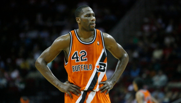
#5 – Buffalo Braves (1971-1973)
Before they moved out West and became the Clippers, the franchise was located in Buffalo and called the Braves. They had some decent powder blue jerseys in the mid-70s. Prior to that, the Braves donned these threads.
The number placement about the small “Buffalo” is tacky enough. What makes it even worse is its because there’s a diagonal set of lines overpowering the uniform. Also, is that supposed to be a “B” with a feather? It looks like a bird. This one is confusing all the way around.
#4 – Retro Jerseys (tie): Chicago Bulls 2005 Chicago Stags Jersey/Memphis Tams 2012
Edition I tried not to include retro jerseys but they were originals at some point so why not? This first one is painful to look at as a Chicago Bulls fan. The Bulls paid homage to the old Chicago Stags. There’s just something about the jersey being one color and the shorts being another color that aggravates me. The way-too-big “Chicago” on the front doesn’t help. I’m pretty sure the Bulls lost this game by 20.
The Memphis Grizzlies didn’t learn from the Bulls. They rolled out the ABA Memphis Tams edition two tone jerseys in 2012. I like retro jerseys occasionally, but I can’t ask this enough. Why have two different colors for the jerseys and shorts?

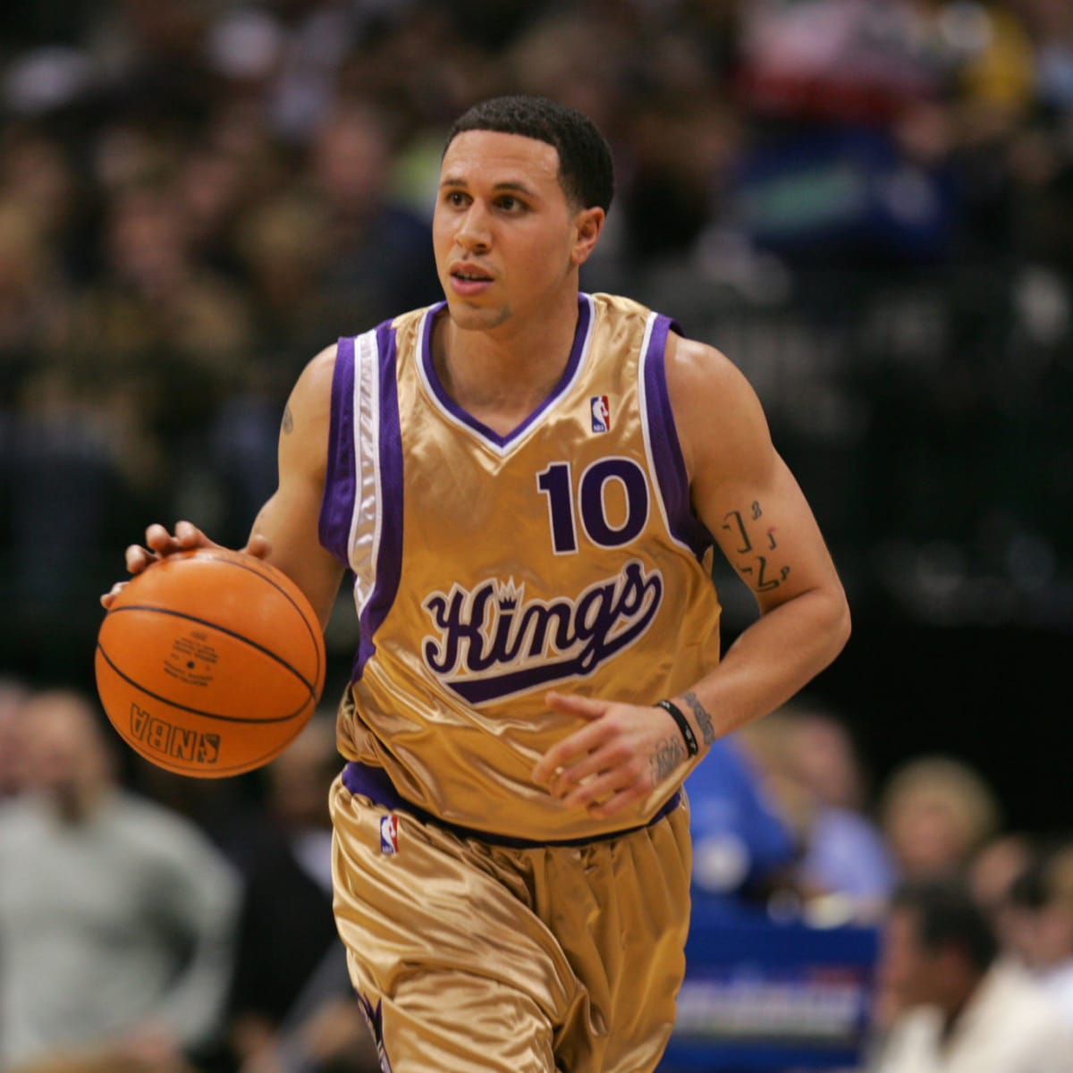
#3 – Sacramento Kings Alternate Gold Jersey (2005-07)
ESPN once named these the worst jerseys in sports history. They make #3 on my list. No wonder the Kings franchise went on a playoff drought! A franchise called the “Kings” should probably have gold incorporated somewhere in their uniforms. I’m not sure a primarily gold uni was the way to go.
The three-tone stripe down the left side of the jersey is random and unnecessary. The cursive Kings font isn’t bad, but placing it under the number looks odd. Also, what’s with the number being placed in the upper right corner of the jersey? This would have been a more aesthetically designed jersey if they flipped the team name and number. Maybe. Probably not.
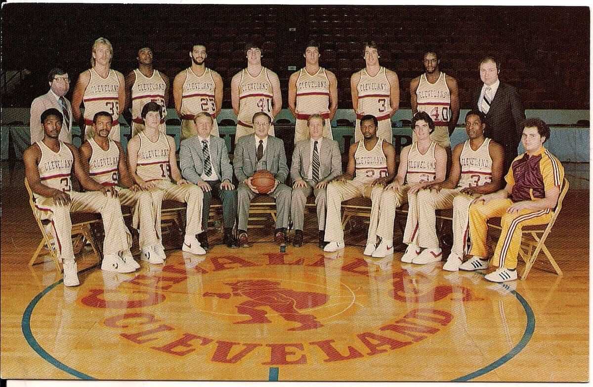
#2 – Cleveland Cavaliers Home Uniform (1980-83)
The Cleveland Cavaliers weren’t much of a winning franchise before they drafted LeBron James. They weren’t great at selecting uniform designs either. Most franchises elected to go with white home uniforms. Not the early-80s Cavs though.
The Cavaliers decided that an all-gold uniform was the way to go. That’s not so bad. Adding a random white and wine stripe across the chest along with boring font puts this uniform on the list. Woof.
#1 – Sleeved Jerseys (2013-2017)
No. Just, no. Call me a basketball purist, but I’ve always hated short-sleeve t-shirt jerseys with a passion.
This isn’t the Louisiana Tech Lady Techsters of the 1980s. I haven’t found the stats to support this, but I bet NBA who wore these sleeved jerseys shot worse. They were probably more uncomfortable to shoot with too.
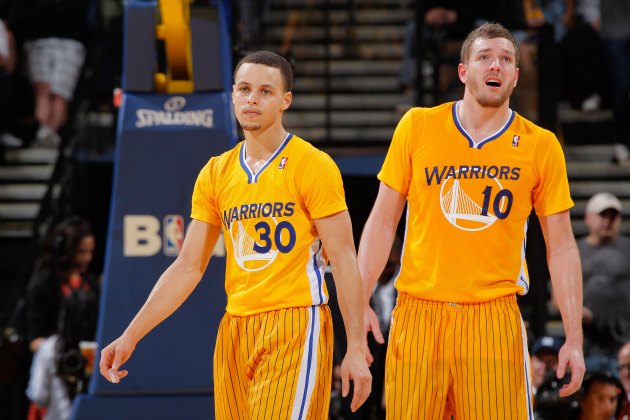
The Golden State Warriors were the first team to don sleeved jerseys in 2013. I can’t believe the NBA unintentionally affected Steph Curry’s shooting, of all people. The NBA teams that played on Christmas
Day in 2013 all wore sleeved jerseys. Other teams trotted out their squads in sleeved jersey later on in the season including the Washington Wizards, Boston Celtics, Los Angeles Clippers, and Chicago Bulls.
Some how LeBron and the Cavs won a championship wearing sleeved jerseys. Go figure. Thankfully, the NBA opted to move away from Adidas as their jersey supplier in 2017. I’m even more thankful that sleeved jerseys haven’t made a comeback six years later.


.jpg?alt=media&token=57983ccf-70a5-4a42-b058-040de5a45ed5)